THIS IS THE REFLECTION SECTION
All my reflections and thought processes in each work. It can be quite long.

1.1 INTRODUCTION TO GRAPHIC DESIGN

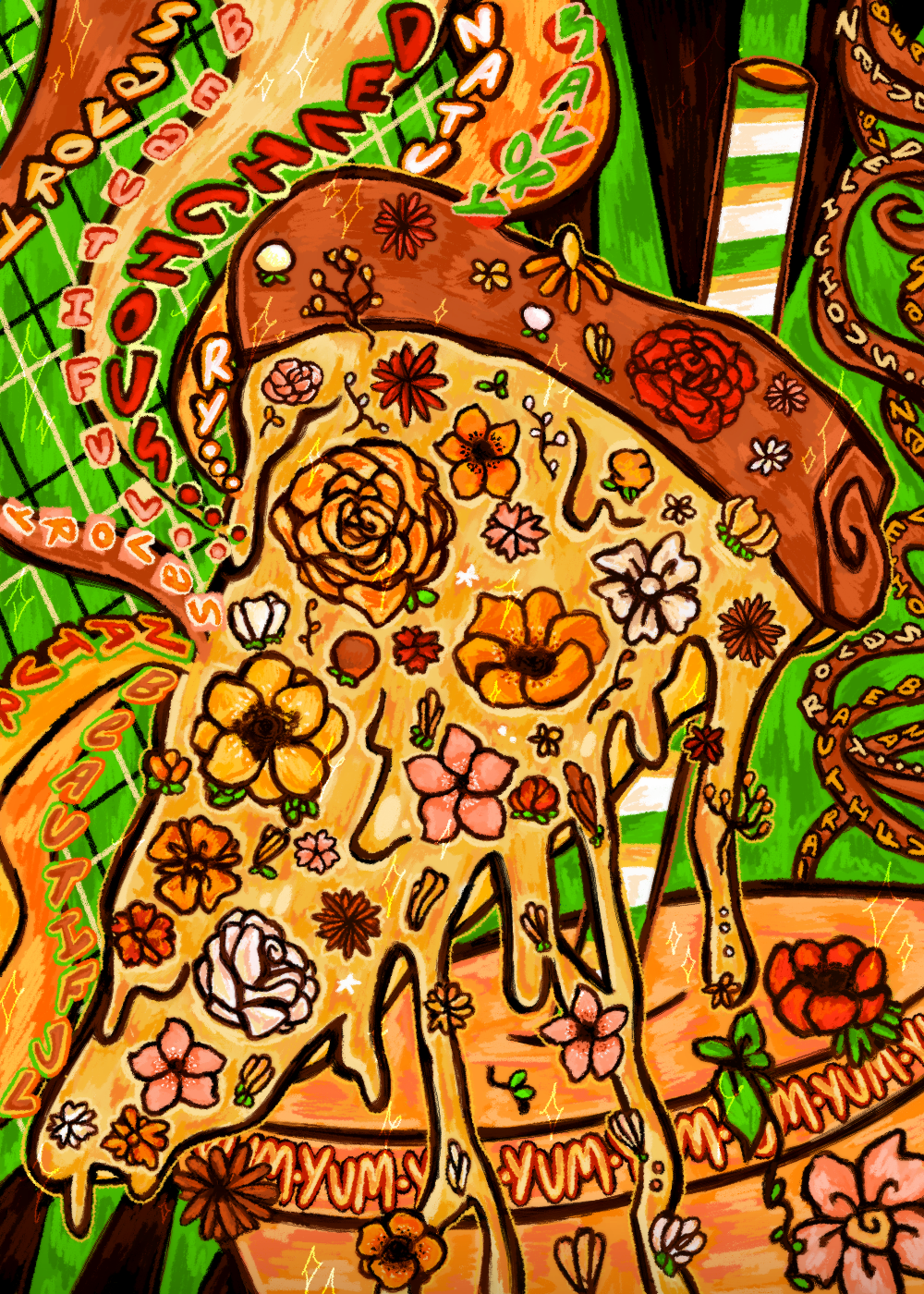
Savory Nature
With the first lesson of this semester tackling the introduction of graphic design, I wanted to create a representation of what I learned through a few of its key concepts. Through visuals and typography, graphic design conveys a message or idea in its design while capturing a viewer's attention. I didn’t want to make something with a straightforward message, instead, I wanted to make something that captures one’s attention, with a focus on the senses, particularly on sight, smell, and taste.
My favorite graphic designs are always posters that have vibrant colors, with smartly laced typography that is able to blend in with the tone of the visuals. Having both the visuals and typography work in tandem strengthens the message of a design for me.
I kept in mind those elements and added them to my illustration. I purposefully chose warmer colors that both have a connection to food and nature, since those 2 are meant to be the contrasting themes I wanted to portray. Red and yellow especially are used a lot in fast-food marketing, but I chose to highlight yellow more since it strikes a nice balance between the two (warm, inviting, and invokes hunger without being too strong in the eye), with red instead being used mostly for the flowers, connecting once again the themes of food and nature.
I was pretty hungry when thinking of concepts so I wanted to put food somewhere in my illustration, but I wanted something more eccentric as well so I thought of another thing I liked, flowers. People love flowers and people love pizza! They’re both things people wouldn't take their eyes away from, but a pizza isn’t associated with beauty and nature, while people wouldn’t describe flowers as savory and delicious.
My aim isn’t to give a direct message, but a more indirect one, with people questioning themselves as different senses clash together upon looking at such a piece. A fragrant flower and a fresh pizza both have great, but clashing aromas too don't they? Yet the dripping cheese looks like it would melt in your tongue. To eat or not to eat? To smell or not to smell? Nevertheless, at least the sense of sight can agree they are both good to look at.
When you think about it deeply, there are a lot of things to intertwine between the subject of flowers in nature and a delicious pizza. Pizza was born from kneaded dough composed of flour, yeast, and water; with oil, cheese, and tomato sauce all coming from nature itself through mills, farms, and the seeds of the soil. Flowers have less of a connection with pizza, but more in terms of being delicious. Even if humans don't usually consume flowers, I’ll bet insects like bees see the pollen of flowers like delicious pizzas for themselves.
There are a lot of fun ideas to capture and connect when portraying contrasting subjects, and it is also a challenge to blend those ideas in a way that makes them harmonious. Choosing colors that would be both appetizing and delicious, as well as natural and beautiful. By making the cheeses’ consistency seem like one of honey and tree sap; and making the background’s checkered pattern invoke both the pattern of a table cloth and a picnic cloth, I hope I was able to convey the contrasting ideas of savory nature in one’s mind and senses.

1.2 EXPLORING PRE-MODERN GRAPHIC DESIGN

Calling all the Masterpieces
During this lesson, I was able to be engrossed with all the types of artworks different civilizations were able to create with the tools and ideas they had in their culture. I couldn't choose just one, but I did want to attempt certain pieces that caught my eye.
The manuscripts were my favorite since it never crossed my mind that there were people who actually painstakingly wrote each text in a book and even artists who added visual images, decor, and that particular golden shine seen in those manuscripts. That’s exactly why I chose to add scribes in my work this time, all the while getting to experience the labor of adding colorful details and a glowing shine to the manuscript they are both sitting on.
One thing about me is that I'm impatient when it comes to adding keen details, so this piece was quite a challenge to me. Having a cool manuscript wasn't enough, I still wanted to give appreciation to all the iconic artworks past civilizations bestowed upon us. The wall of hieroglyphics representing ancient Egypt was fun to draw even if I didn't understand what those repeating symbols could mean. The intricate pottery and ceramics of ancient Greece were also something I wanted to give a try illustrating. They mainly focused on silhouettes and shapes, and it was interesting trying to portray body language when the subject does not have a face. I’m also a fan of repeating patterns and shapes so that was a great addition. I also attempted the art style mostly seen in Ukiyo-e or old Japanese wood prints. They have distinctly thin lines and portray the facial features of their people in a very artistic way. In the bottom left are some small, simple crests from medieval Europe since I found that aspect of their works interesting. They’re more subtle compared to the other elements I chose to illustrate but I think they make a nice element to add.
As a finishing touch, I added overlays of photos I took while on vacation to give a very subtle nod to how technology has influenced artworks in modern times. I didn't want to give it a big focus but you can see parts of a photo in the bottom left with the crests, which is why I chose to keep them uncolored. I almost lost my mind thinking about coloring those details in the manuscript decor and letters, so I had a lot of respect for the scribes and illuminators back in the day.

1.3 RENAISSANCE ART AND DECORATIVE ARTS

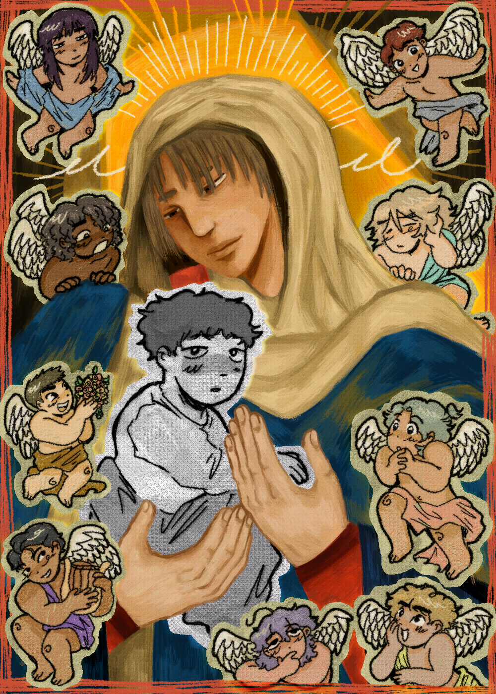
Mother Renaissance Art with her Cartoony Child
As much as I admire the precise and beautiful artwork made in the Renaissance period with their intricate sculptures and realistic paintings, I’m not really a person who is drawn to classical realism. Still, I couldn't help but want to attempt something like it, adding a more painterly style to a theme so tightly associated with this period, Christianity. A straightforward religious piece that has the realistic elements of perspective, chiaroscuro, sfumato, and a keen detail to human features should be enough right? No.
With people focusing on one style they're able to concentrate and get things from it, but I can absorb information with much more curiosity and intrigue when I put it side by side with my personal style and interests. The realistic Rennaisance style is such a beauty to behold but I can't be satisfied with myself if I just recreate it. By adding the absurdity and twist of putting a style opposite to its core realistic elements, it piques excitement within me to learn and create.
What makes the styles stand out? What makes the styles so different from each other? How did people find value in this? How did it grow into something so different? Why is it so challenging for me? Why is it still so interesting to try out? Especially when making art that serves to be a personal reflection such as this, I aim to add my own twist, as absurd as it may be.
It was a challenge trying to recreate a more realistic style, but even more challenging was attempting to blend in the more cartoon-oriented style with the painterly Renaissance art. The cherubs are cartoony as well, looking as if they were colored using crayons with little to no shading. But the core standout feature is the cartoon baby (cartoon baby Jesus…) who I purposefully made monochromatic to highlight how different he looks from the rest, with a crumpled textured paper overlay and a cutout outlining his shape as if he were from a different time altogether.
Of course, the religious theming was borrowed from the many iconic Mother Mary carrying baby Jesus paintings seen across so many cultures and periods. To be honest I could never get tired of those paintings since they're always so beautiful and have their own artistic touches. When looking at it symbolically, I like to see this piece as the art of the Renaissance period influencing and raising the art of today. Fine art enthusiasts and artists that focus on realism still exist today of course, but just like me, some stray away from that and more into the cartoony, stylized art styles seen in animated movies or cartoons. Those artists like me may not strive for realism or painterly styles in our art as the old masters do, but we’ll always honor and remember their works as a way of inspiration and something to look up to, like a child to their mother.

1.4 ART MOVEMENTS THAT SHAPED OUR WORLD

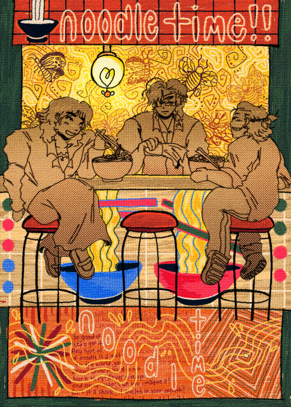
Noodle Time!
This piece was actually the one I've been looking forward to the most since it incorporates adding my favorite subject, people eating in a decorated eating place. The lesson was about art movements, and the concept of blending all those art movements in different sections of the noodle shop came quickly to me since restaurants and cafes alike implement aesthetics that have touches of their own chosen art movements.
The walls of the noodle shop are Art Nouveau-influenced, with organic flowing lines and swirly patterns. I even added insects as a nod to the movement’s themes of nature. Insects with their wings and distinct shapes make a good subject for Art Nouveau pieces which is probably why they are always made as brooches or jewelry.
The overall structure and design of the shop itself and its furniture are Bauhaus-inspired, as are many trendy restos and cafes these days. Aesthetically pleasing geometric shapes found in the furniture and in the signage, are straightforward but still nice to look at due to the usage of colors that catch the eye. I found that using the checkered pattern was effective due to its simple yet stylish look. There are less flowing swirly lines compared to the Art Nouveau-inspired walls, and even the curved lines found in the chairs and the wavy lines found in the noodle visuals decorated on the table have a more uniformed feel to them.
The noodle shop’s floor is inspired by the Swiss Style/International Typographic Style. It's more eccentric and out-of-the-box with its design, yet still makes for a unified overall look. I added more typography, geometric shapes, and primary colors, of course, I still had to add the visual nod to the noodles via the wavy lines, making for a direct communication to the audience that this is, in fact, a noodle shop that sells noodles.
As for the Postmodernism aspect of the illustration, the whole illustration was supposed to represent Postmodernism in the way it combines all the aspects of different influential art movements. They all came from distinct cultures with their own themes and outlooks, divided by time periods and having their own fans and critics, but in this piece, they all blend seamlessly into one another as the viewer notices what makes each movement unique and similar to one another. They're all able to harmoniously collide in a piece that celebrates another form of bonding that connects people, eating noodles together
Lastly, for Digital Art, it's pretty self-explanatory since the illustration was made digitally. Though the added textures overlaid on it are supposed to make it have a more paper-like quality to it, which is a touch I love adding to my art.

(still) 1.4 ART MOVEMENTS THAT SHAPED OUR WORLD

A Lot on the Mind
The reflection of this piece will be pretty short compared to the others since this wasn’t something I planned before the portfolio, only serving as a fun thing to draw during class since I really wanted to draw something with Art Nouveau elements.
I'm not someone keen on elaborate detail, but ornate shapes and lines are always so fun to look at for me. They hypnotize my eyes and make me want to look so hard that my eyes start bleeding. I wanted to implement the many loose shapes and lines Art Nouveau artists added in their art since it all seemed so free and expressive, so I just let myself go loose with all the colors and shapes. Having the floors and bench surrounded with Art Nouveau-inspired swirls, circles, and squares adds a contrast to the more crass and graffiti-inspired vandalism on the wall of the illustration. That contrast was done on purpose since I love adding juxtaposition to illustrations.

1.5 THE DIGITAL REVOLUTION AND CONTEMPORARY DESIGN

Are You Working, Son???
In the realm of digital design, I wasn’t used to hearing the influence of Paula Scher, but upon seeing and hearing about her works in a prior class discussion, I knew I wanted to make something that was inspired by that. The way she was able to use typography not just as a medium to communicate ideas through words, but also as an art tool that becomes the visual and design itself really hooked me.
I managed to gather many posters and works of hers online and observed how each phrase or paragraph of text went around the silhouettes of the people in the poster and how their colors made them stand out as part of the piece. Since her style started as something made traditionally, that traditional magazine and scrapbook feel was still carried on even when she transferred to more digital processes. It just goes to show how powerful the tools of technology are, but also how people are still entranced by traditional-looking digital art that implements that loose and collage-inspired aesthetic.
For my work I wanted it to look simple, yet busy. The countless phrases and words serve as an important background to the illustration since they are what make it look busy and interesting to look at. Due to the theme of my piece being about the everyday bustle and grind of overworking, the text is also supposed to represent inner thoughts and anxieties in a way, but despite it all, the 2 people grappling with these thoughts must keep working to provide for themselves and their families.
The people in the illustration are purposefully left not colored since I also noticed how in many of the inspiration posters I gathered, there isn't much color when it comes to the people used as visual props. It's a smart design choice since it makes them less of the main stand-out and distributes the importance of both the people and the text as part of the graphic design as a whole. I did the same thing with my piece. The 2 people as subjects don't completely blend in with the red color of the background, but their red tint allows the different colored text wrapped around their silhouettes to stand out much more.
The multiple clocks serve as an extra design touch, being placed in the middle with a brighter color makes them the first thing a viewer's eyes would probably be drawn to. It's also another nod to the theme of constantly working since time is always on the mind of those who are busy and need to keep track of their schedules.
